
I often see bad ads. Usually I just skim over them or shake my head wondering whether the client knows they are wasting money. But occasionally – very occassionally – I come across an ad that is so bad it makes me stop, stand up and walk over the nearest person chanting “have you seen this ad?”
I’ve done a few ad reviews on this site (Tom Waterhouse and Nikon) – and to be fair, I wouldn’t go after ‘Mum & Dad’ operators, because chances are they are behind the 8-ball in terms of marketing knowledge. But big institutions should know better. They should have the tools and knowledge to make effective ads. Or at least know how to avoid making lackluster ads.
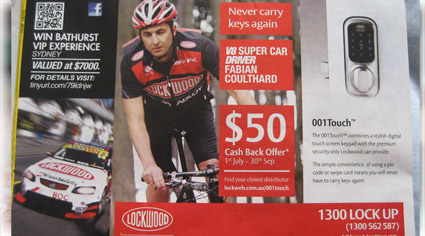
Below is perhaps the most confusing printed/magazine ad I have come across in a long time. It’s by Lockwood. Although I stared at it for a few minutes, it took me a while to figure it out. Let’s examine the ad and find out what went wrong.
To see a larger version of the ad, click the image below:

Ineffective Lockwood Ad. Click to See a Larger Version
Why Did This Ad Suck?
Taking a step back, I think this ad suffered from too many people trying to say too many things. This was probably driven by an internal political decision within Lockwood to keep a bunch of people from different departments happy. Unfortunately it doesn’t keep the reader happy.
The ad tried to mix a sponsorship experience message and product offering. Given there’s not enough room to achieve both these objectives, this decision was poor. The ad comes across as a mish-mash that totally kills its purpose. A good ad is always single minded and has a clear headline and call to action. This Lockwood ad is multi-faceted, containing multiple call to actions, spread across the whole ad. And confusing imagery. After reading it I needed to lay down.
To really experience the ad, you need to imagine a spruiker on outside a Lockwood store, bringing the ad to life. He would take a deep breath and say:
“Win a Bathurst experience at $7,000 – come ask me about it. And you’ll never have to carry keys again. And we’ve got V8 Super Car driver Fabes Couthard riding a bike here. Oh and don’t forget our $50 cash back offer that closes soon. I’m from Lockwood by the way. And we have a product called 001Touch. It’s a touchscreen that you put in your home, so you don’t need keys. Give us a call.”
…That’s literally how the ad presents itself. A zillion thoughts without any cohesiveness.
Parts of the Ad That Failed
- No clear headline: Where does the reader start?
- Multiple images: Making the piece too complicated and confusing
- Person on the bike: It’s not clear who this is. If it’s the V8 Super Car driver, what has cycling got to do with V8 driving?
- Logo position: Bottom middle. Perhaps the worst location possible
- Ill positioned headline: The headlines aren’t being positioned with the relevant pictures, causing confusion
- Multiple call to actions: The ad has three separate call to action boxes.
“Ninety-nine percent of advertising doesn’t sell much of anything.” David Ogilvy
(Also, Darren Rowse has a good post about David Ogilvy quotes)
Elements to a Good Ad
Although ads have many different objectives, which are either highly emotional based (e.g pure car brand messages) or highly rational based (e.g supermarket specials for the week), there is often a middle ground that most ads play in. In general a good printed ad will have the following elements:
- Headline (stating problem or solution)
- Image
- Body copy (the more copy you have, the less people will read your ad)
- Brand
- Call to action (call us, visit our website or store)
By following the above formula, there’s a good chance that your ad will be on the right track to being engaging.
Helping grow your small business,
David Moloney
Small Business Planned