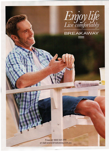
Occasionally I come across a bad magazine ad- one that I can’t understand, despite gnawing at my top lip. Below is one such ad – for a brand named ‘Breakaway’.
This was a full page print ad in a recent edition of Victoria’s Royal Auto magazine (a motoring club that provides insurance and roadside assistance).

What The Hell Are You Selling?
What The Hell Are You Selling?
This is a pure brand ad for Breakaway. It has all the calling cards of a brand ad, such as:
- minimalist messaging
- one big image no overt product/service to buy
- no prominent call to action
But since I had never heard of the brand Breakaway, the ad became ambiguous to me. Who the hell are Breakaway? What do they do? What can they do for me? Based on the ad, I figured they were either a:
- life insurance company
- holiday company
- life coaching company
- clothing company
- furniture company
There were no clues in the support copy or any disclaimers. The casual man just smiled at me, almost laughing at my frustration.
So I asked around.
No one under 35 years old had heard of them. But my Mum had.
Apparently they are a clothing company.
Was This a Bad Ad?
Not necessarily. I’m guessing the ad was aimed at building an emotional connection for people with existing knowledge of the brand. And if you’re someone else… go to hell.
This approach reduces the support copy needed, keeping the message as pure as possible. And in the world of ad clutter, fewer elements yield better cut through.
That being said, I would have put some sort of category identifier on the ad – perhaps at the bottom. This would have helped the puzzled readers start to begin a relationship with the brand.
David Moloney
GET FREE INSTANT ACCESS TO THESE
THREE ESSENTIAL SMALL BUSINESS RESOURCES
(To help you maximise your business)

15 Recommended Downloads for Small Business Owners

10 Website Mistakes That Cost You Sales

How to Get More Customers Contacting You Automatically

